Pop-up Plate An end to end mobile app concept that connects chefs and spaces to bring you unique dining experiences
MY ROLE
UX Researcher
UX / UI Designer
Brand Designer
TOOLS
Figma
Google forms
DURATION
3 months
The process
1. UNDERSTAND
BACKGROUND
During the 2020 COVID pandemic, New York city regulations required bars to serve food along with alcohol, which sparked a surge in food pop-ups and reshaped the culinary landscape. The rise of TikTok also leveled the playing field, empowering Gen Z and late Millennials to forge their own paths as chefs, break away from the 9-5 work-life, and bypass the traditional path to be a chef.
PROBLEM
Food pop-ups offer chefs the freedom to experiment with bold recipes, have dream collaborations, reinterpret dishes, and introduce food from diverse cultures. However, to have a successful pop-up, a chef needs a space.
Businesses sit idle during slow or off-peak hours, presenting an untapped opportunity to bring talented chefs into underutilized spaces. Both businesses and chefs reap benefits from this arrangement — chefs rent spaces to bring a pop up vision to life, while businesses unlock new revenue streams and boost foot traffic, thereby generating buzz and revitalizing their spaces.
SOLUTION
Design an end-to-end app that solves a major pain point for chefs: find pop-up spaces. Cold-calling restaurants can often be an uncomfortable and frustrating experience, but this app removes that barrier entirely. My aim is to empower chefs to break into the pop-up scene and build thriving personal brands that make them stand out in the competitive food landscape.
2. USER RESEARCH
RESEARCHING THE PROBLEM SPACE
Secondary research revealed that pop-ups were initially seen as ‘stopgap measures’ for struggling chefs and restaurant owners during the pandemic, but have since disrupted the restaurant scene.
Motivations for hosting pop-up events vary from testing concepts for future brick-and-mortar establishments, gaining exposure and recognition in the industry, or making a living without the burden of committing to a lease or paying rental costs.
Pop-ups serve as a low barrier to entry into the world of food, serving as a launchpad to test new culinary ideas.
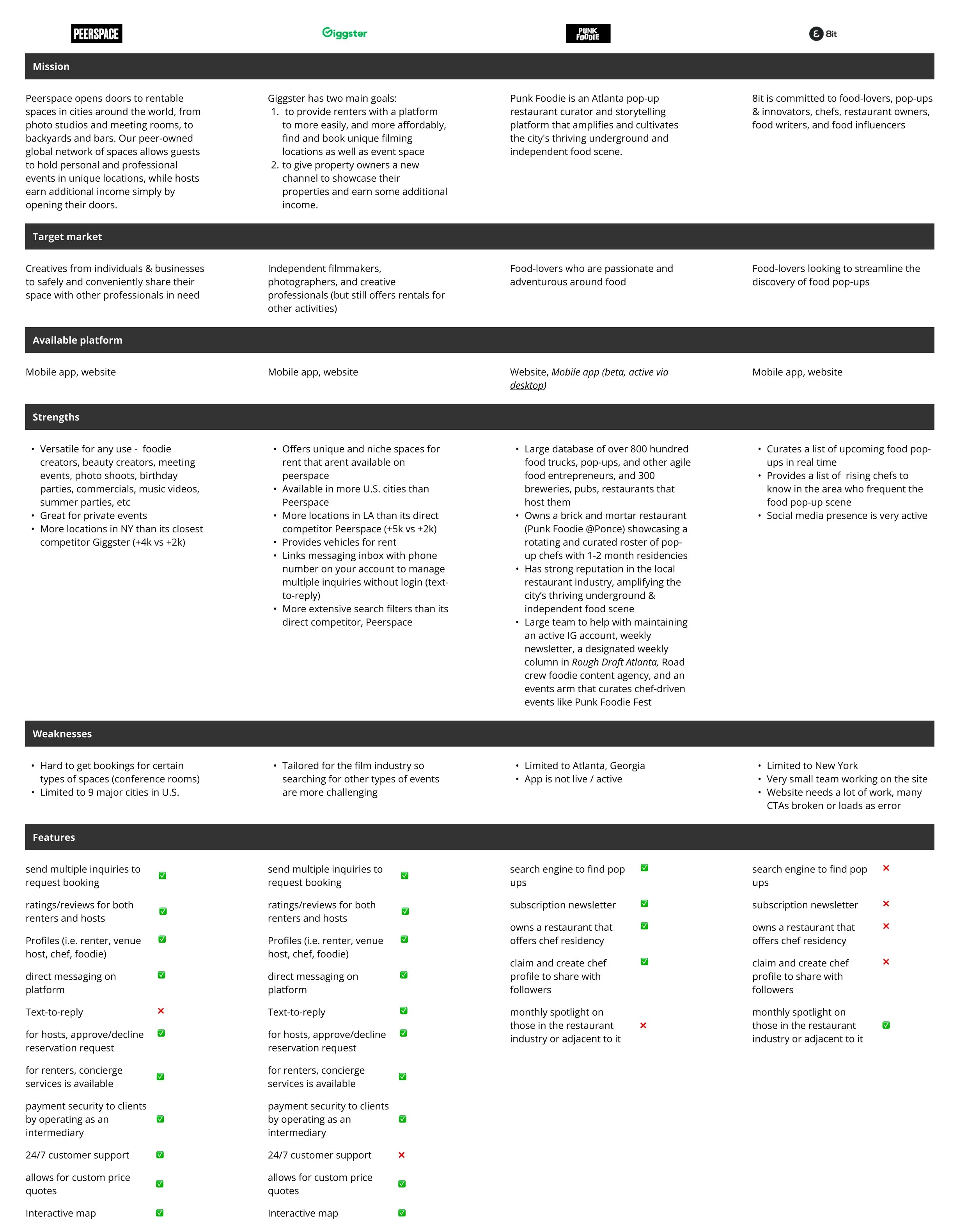
COMPETITIVE ANALYSIS
Looking at the popular players within the space, I researched an array of platforms that encompass event discovery and finding rental spaces.
Peerspace and Giggster are 2 indirect competitors that offer similar services, but not specific to the pop-up scene. These platforms also share similarities with Airbnb’s design patterns.
Leveraging Airbnb design patterns fosters user familiarity but also highlights the need for my app to offer a distinct value proposition to differentiate from its competitors.
VALIDATING ASSUMPTIONS
Survey with chefs and pop-up attendees
A survey was conducted collecting insights from 25 participants to gauge user interest and learn about user needs, motivations, and preferences. I targeted 4 key communication channels to recruit participants — Phone/text, Instagram, Reddit, and Online design communities (i.e. Discord, Slack).
Survey finding #1: Social media, particularly Instagram and word-of-mouth are the main ways to discover pop-ups
Survey finding #2: Most participants will only attend a pop-up if they are familiar with the chef, or the chef provides a truly unique concept worth checking out
Survey finding #3: Successful pop-up chefs already have strong networks in the culinary industry and rely heavily on their restaurant connections to find suitable spaces
User interviews with 3 chefs
Despite the busy holiday season presenting challenges for recruiting participants, I successfully interviewed 3 chefs / former cooks. Although the interview sample size is small, combining interview feedback with survey results provided sufficient insights to conclude that a desire for a food pop-up app exists.
Interview finding #1: Venue challenges
Securing a space requires strong industry connections, forcing chefs to adapt their concept to any available space instead of finding the ideal match
Interview finding #2: Learn as you go mentality
All participants encountered some type of challenge with their pop up. Each pop-up event offered valuable learning lessons for the next one. Participant feedback revealed key themes, including:
Early promotion pays off: Leveraging Instagram and revealing the menu in advance is crucial for generating initial buzz and attracting attendees
Food safety is crucial: It is important that the space meets food safety standards to avoid logistical mishaps and liability for potential health risks
Fine-dining works best: A fixed menu proved to be a winning formula for pop-ups resulting in higher profit margins, while also providing attendees with a better dining experience
Interview finding #3: Profit sharing lacks standardize practices
Splitting profits between chef and space host poses a challenge that often relies on casual agreements between the parties, a high risk for confusion and conflict
Interview finding #4: Social media is the strongest tool for promotion
Similar to the survey results, Instagram and TikTok are the leading platforms for promoting and discovering pop-ups and chefs and the success of food pop-ups would not be possible without these tools
3. DEFINE THE PROBLEM SPACE
PROBLEM STATEMENT
Based on research, there are two different concept ideas to consider:
an app for chefs to find and rent a space
an app for chefs to promote their event to expand their audience
I decided to focus on concept 1, refining the problem space even further:
Point of view: I’d like to explore ways to connect chefs to venues with available spaces because the biggest hurdle is finding the opportunity to utilize an empty space.
How might we:
...help chefs build up the credibility to cultivate partnerships with available venues?
...help chefs effectively pitch their popup concept to venues?
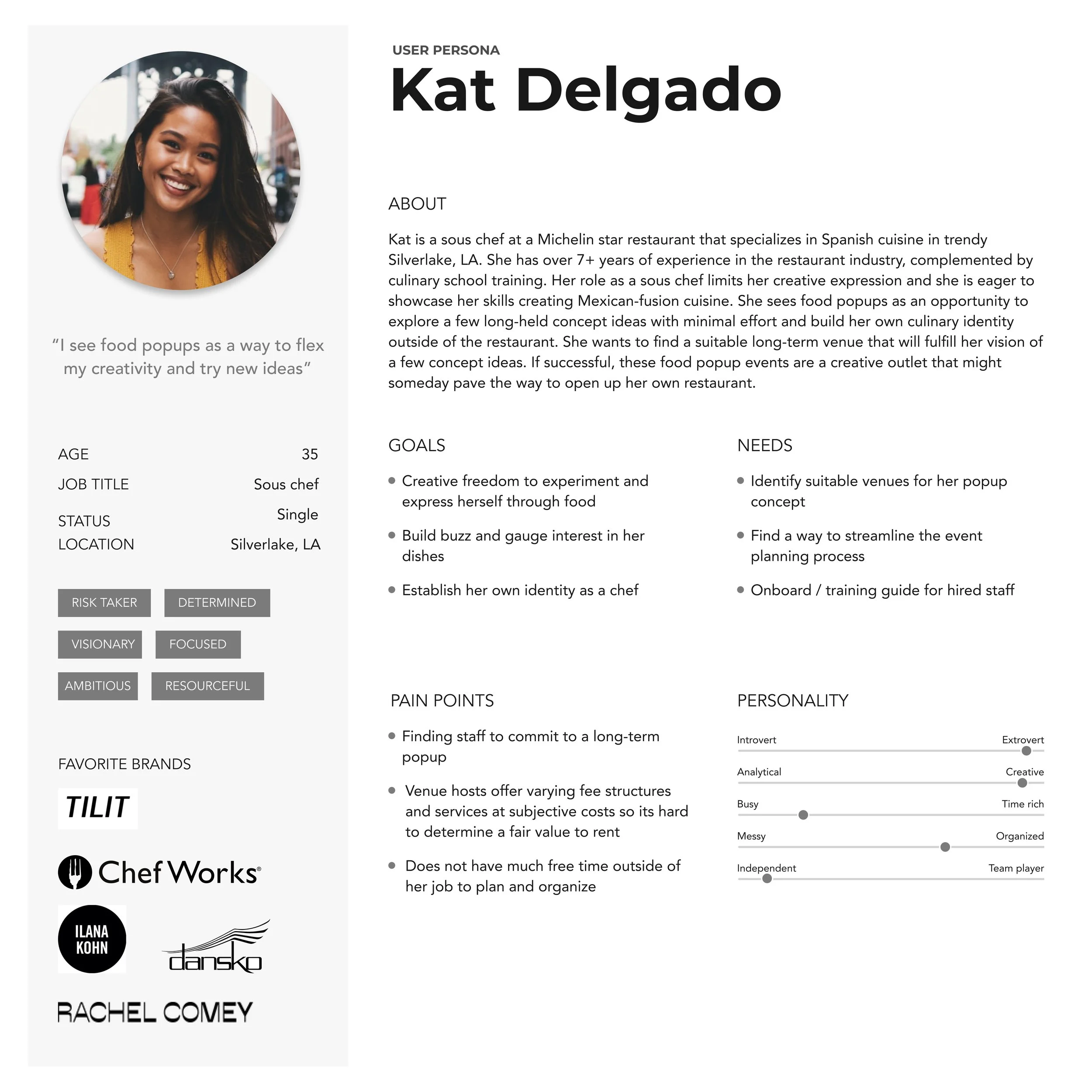
USER PERSONA
Based on my participant pool so far, my users are within the 25-41 age range. I created two types of chef personas representing the target audience for my app.
Rob, a gen Z home cook aiming to break into the culinary industry, seeking short term food pop-ups as a side project and stepping stone into the food scene
Kat, a millennial professional chef utilizing long term food pop-ups to test concept ideas for a brick-and-mortar restaurant
4. IDEATE
FEATURE ROADMAP
In a real-world scenario, limited time and technical resources require teams to prioritize features by sizing impact and effort. With only 80 hours to complete this project, I put together a feature roadmap to categorize features into four buckets:
P1: Must have features were mentioned most frequently in user research and will be added to the app:
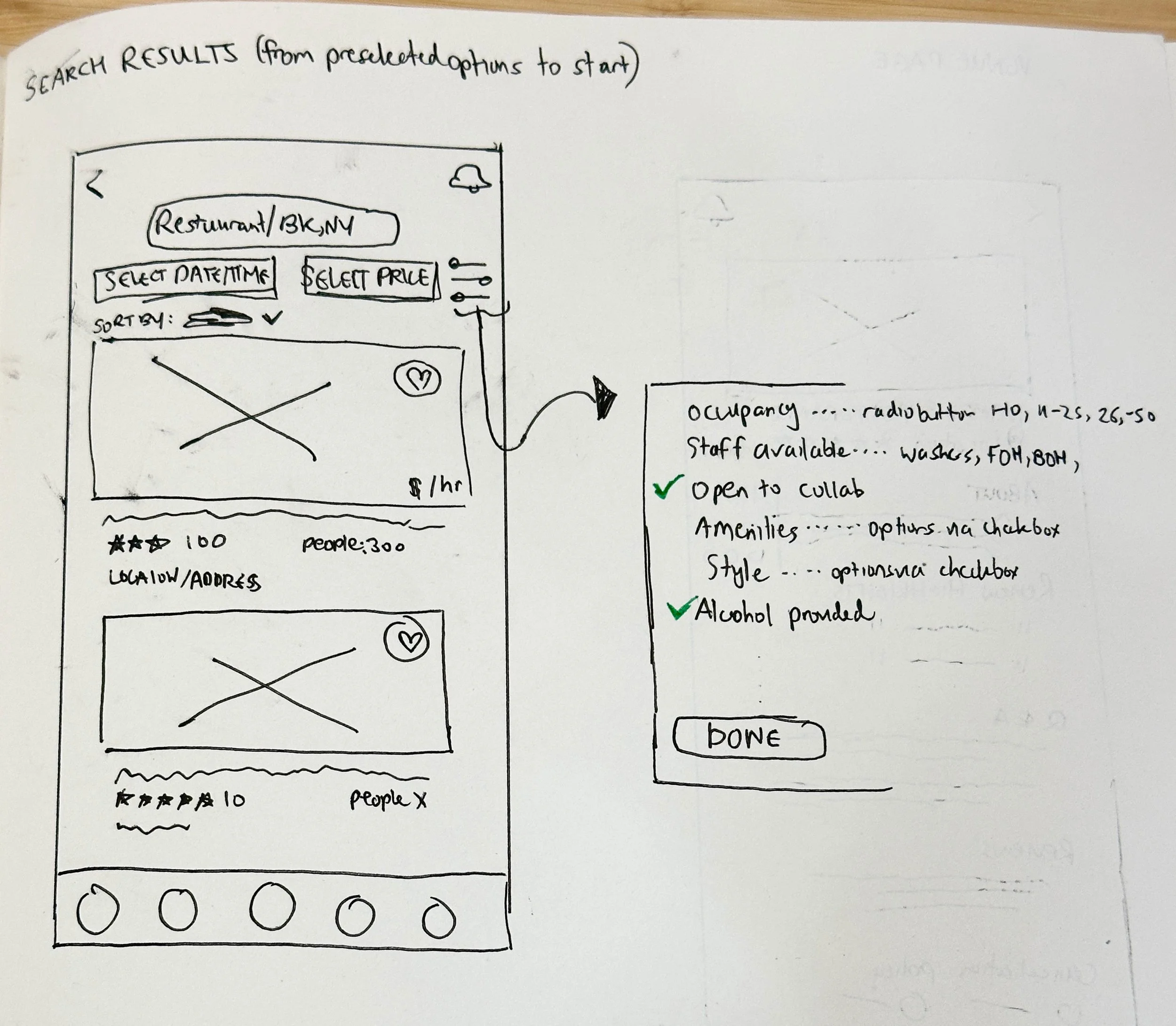
Search engine for venues: Detailed filters to help chefs quickly search for their ideal venue
Venue page: Include interactive map to see location, nearby events, competitive pricing for food in that location etc
Chef profile: Profile showcases enticing photos of dishes to attract the audience, chef's speciality, maybe 1-2 secret recipes that you can see if youre a premium subscriber
Reviews of previous events held by chef: Browsing past and future events is helpful for chefs to get inspiration and see what others are doing
Venue reviews: ratings, subcategorie ratings, text (similar to Tripadvisor, Peerspace, Airbnb)
Interactive maps: This feature would be embedded into searching venues
INFORMATION ARCHITECTURE
Sitemap
The sitemap was informed by the feature setlist and proved instrumental in visualizing the app's navigation and overall flow.
User and task flows
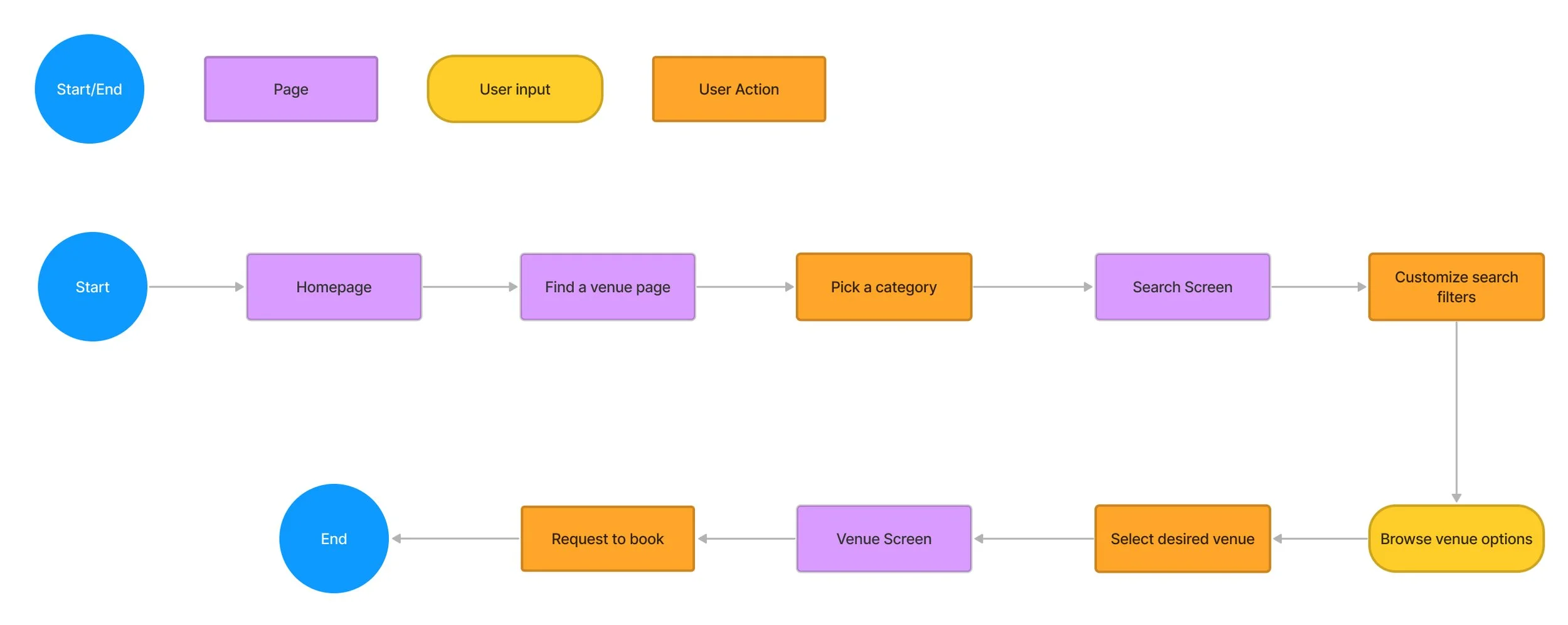
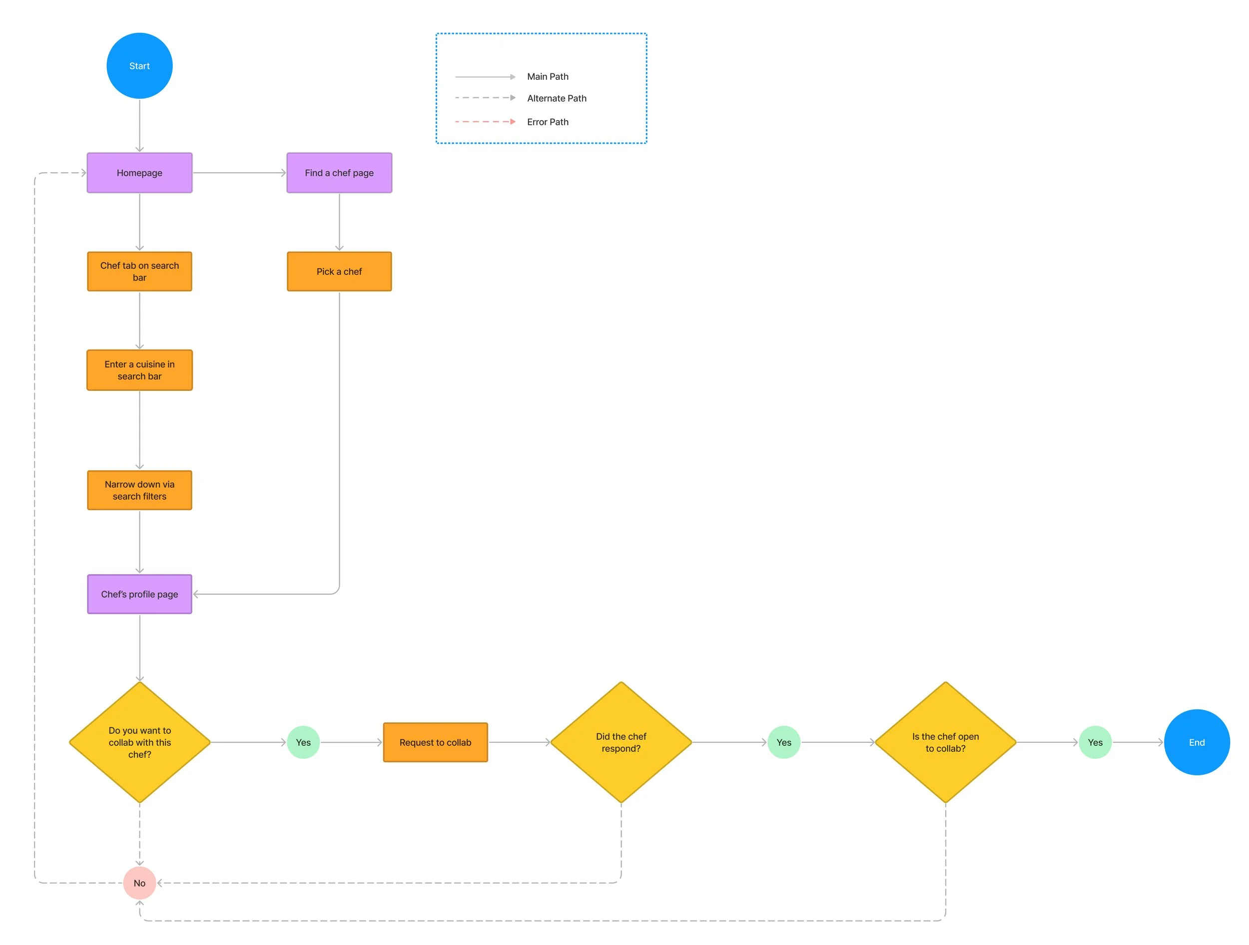
Creating user flows and task flows played a crucial role to ensure user needs are top of mind and to explore ways to set my app apart from competitors. This exercise was also beneficial in mapping out the most efficient paths to accomplish a task in the least amount of steps.
User flow and task flow #1: Browse and book a space
User flow
Task flow
User flow and task flow #2: Browse & request a chef
User flow
Task flow
5. DESIGN
Similarly to the indirect competitors from research, I leveraged Airbnb design patterns to promote user familiarity and ensure seamless navigation within the app.
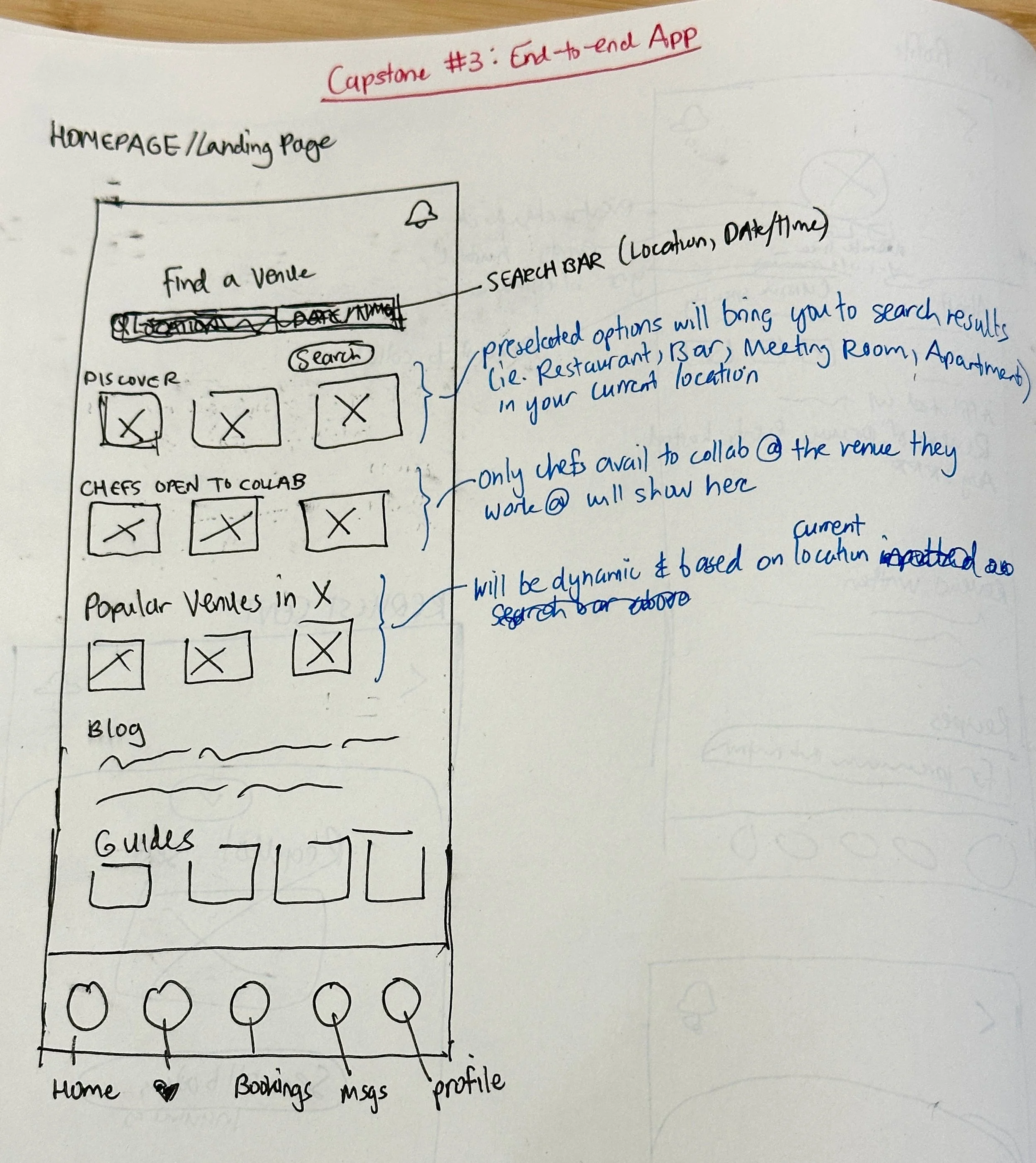
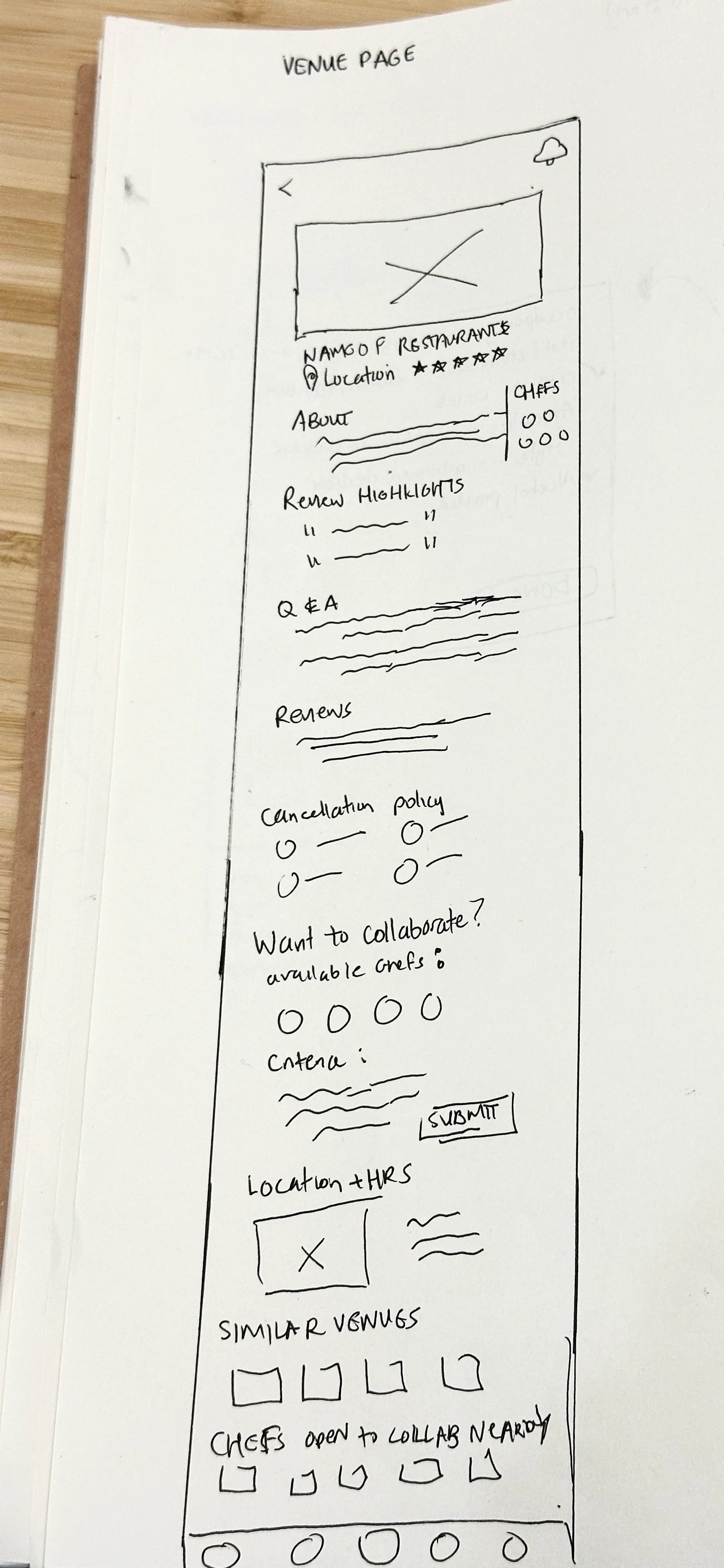
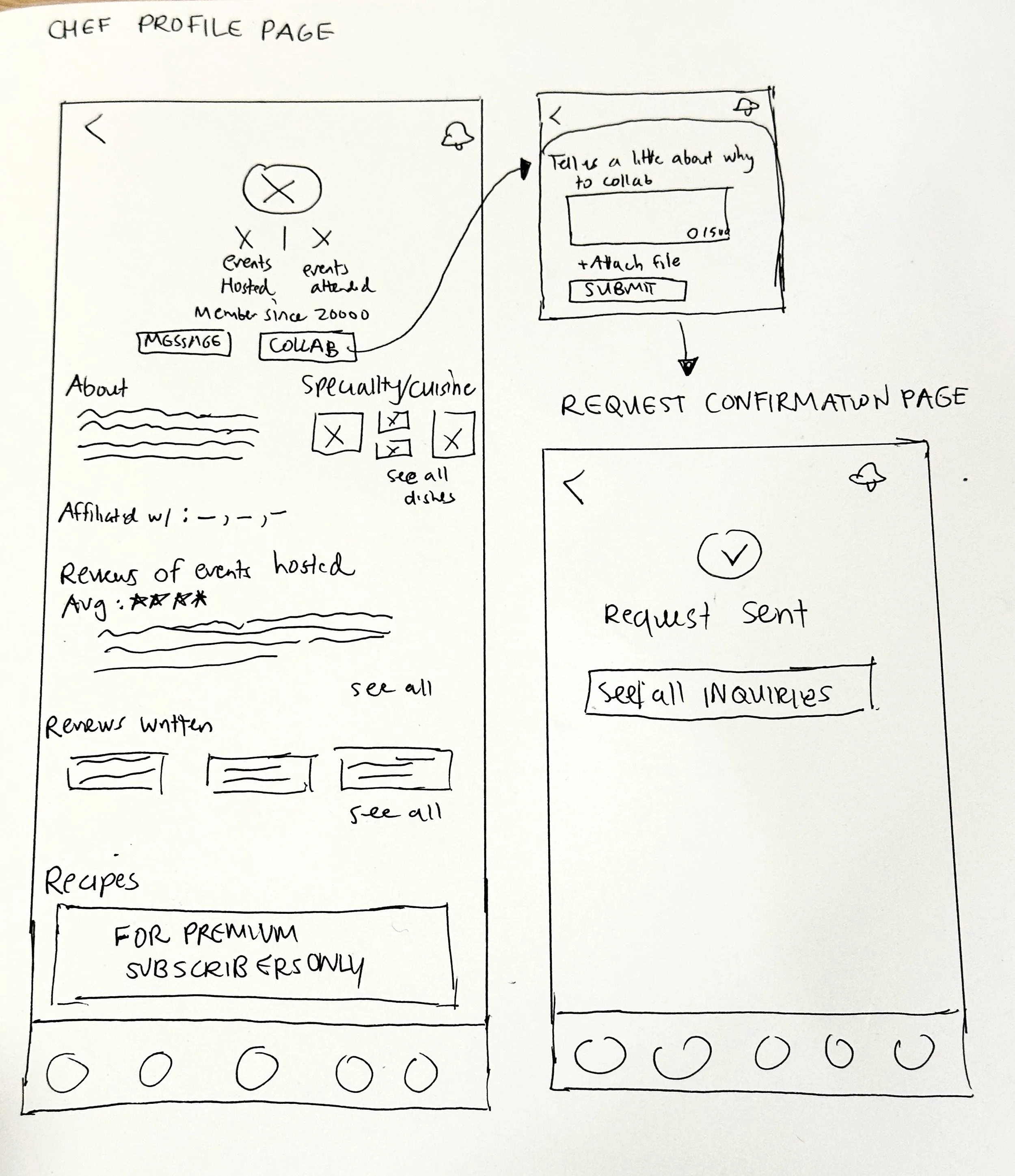
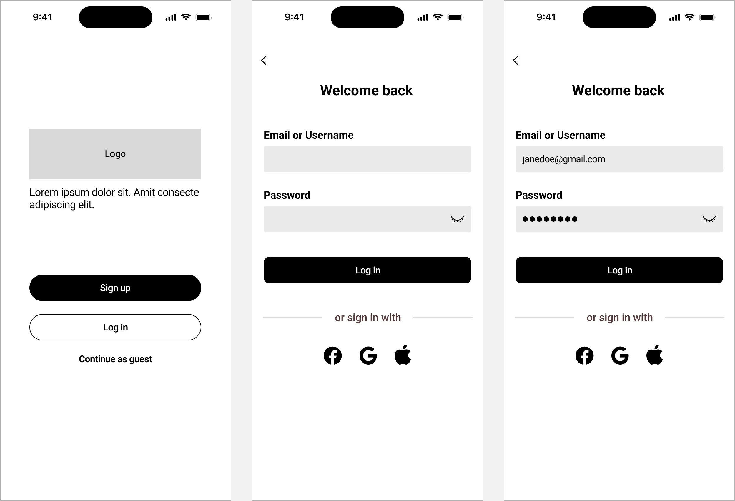
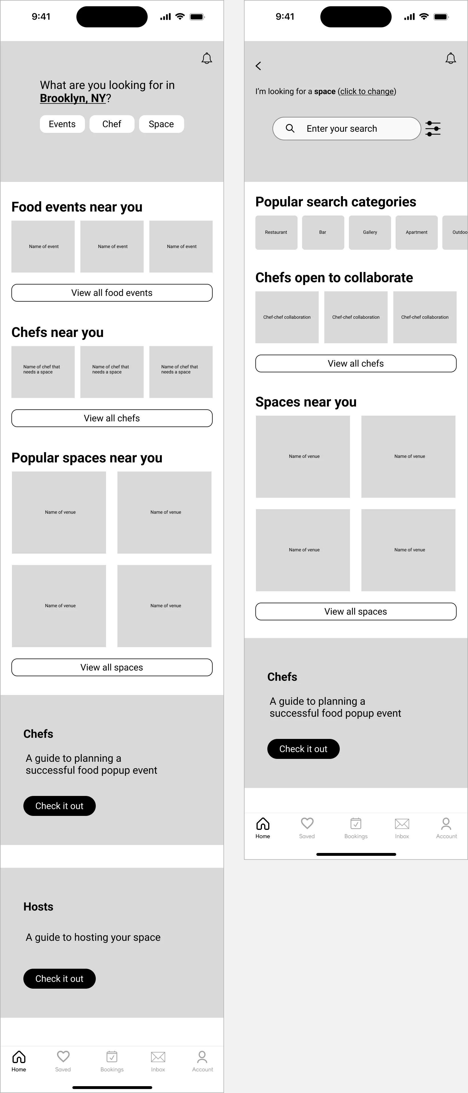
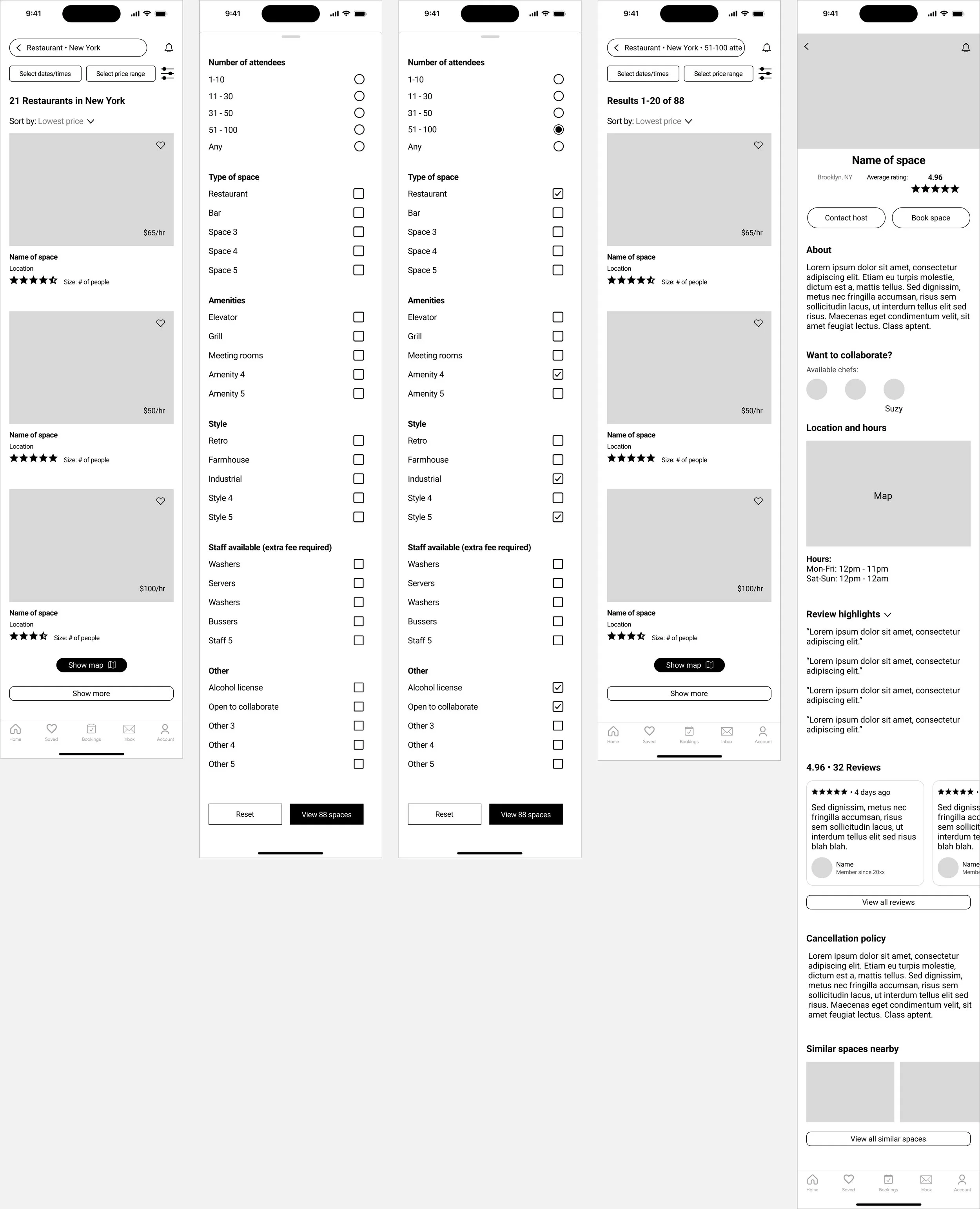
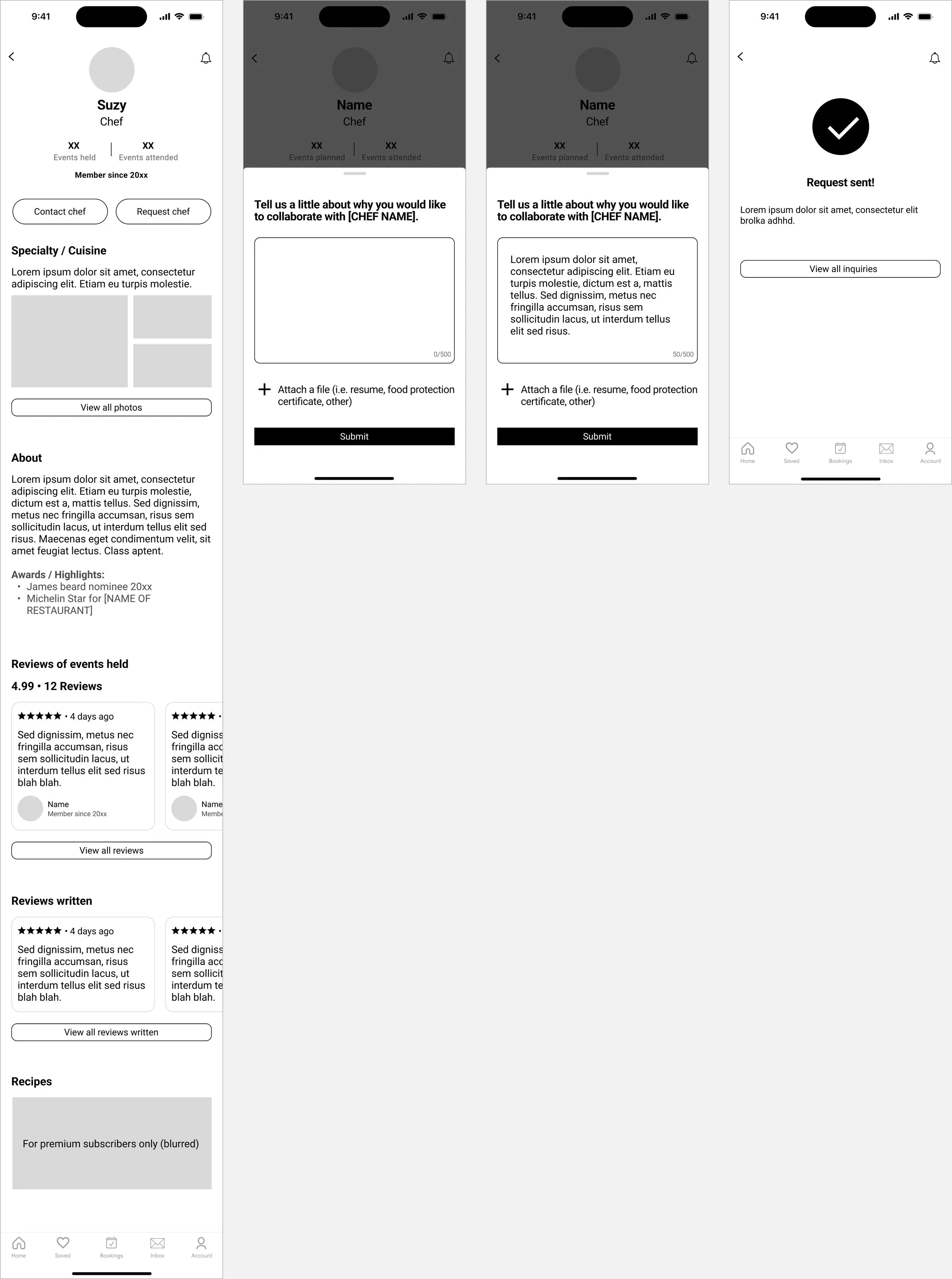
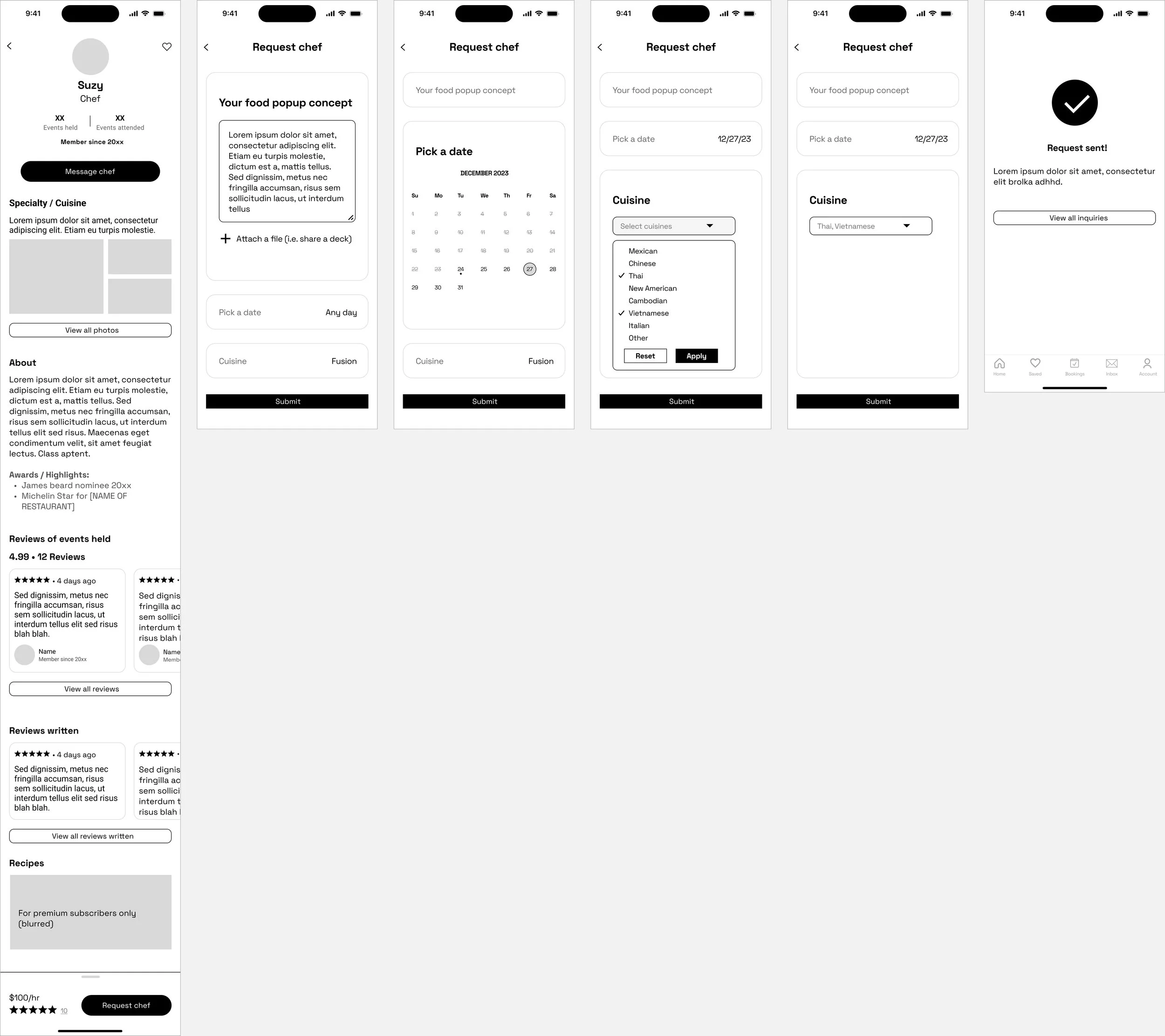
LOW FIDELITY WIREFRAMES
MID FIDELITY WIREFRAMES
MID FIDELITY USABILITY TESTING & KEY FINDINGS
I conducted mid fidelity usability testing with 6 participants to check for major flow issues and gather feedback on branding. Mid fidelity testing unearthed blindspots originally overlooked, saving me valuable time and resources down the line.
A feedback grid was utilizes to synthesize and prioritize the insights, revealing three major findings:
Participants struggled to grasp whether the app catered to chefs or space hosts. The lack of text in the mid-fidelity wireframes likely contributed to this confusion, as users missed crucial context.
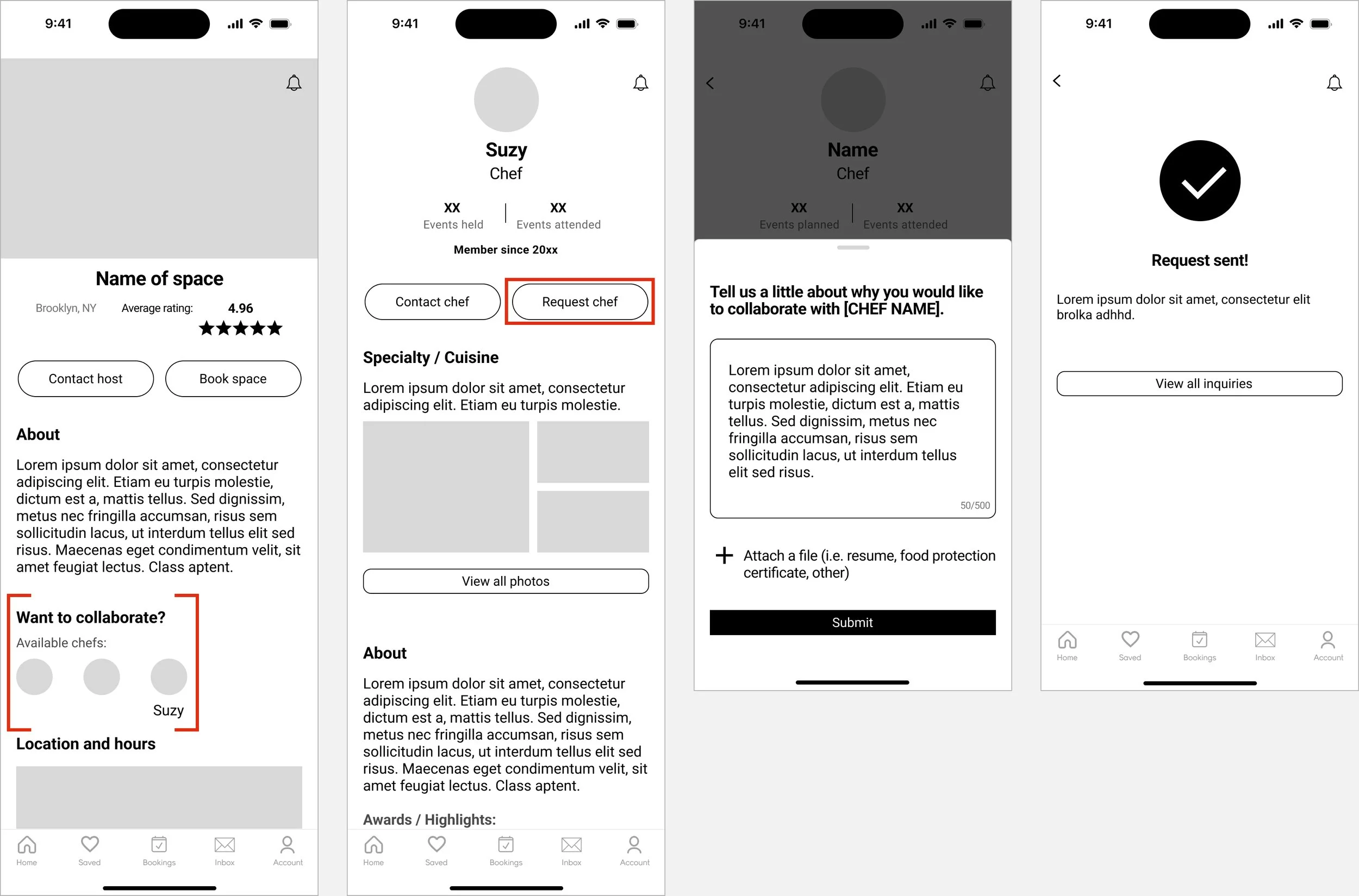
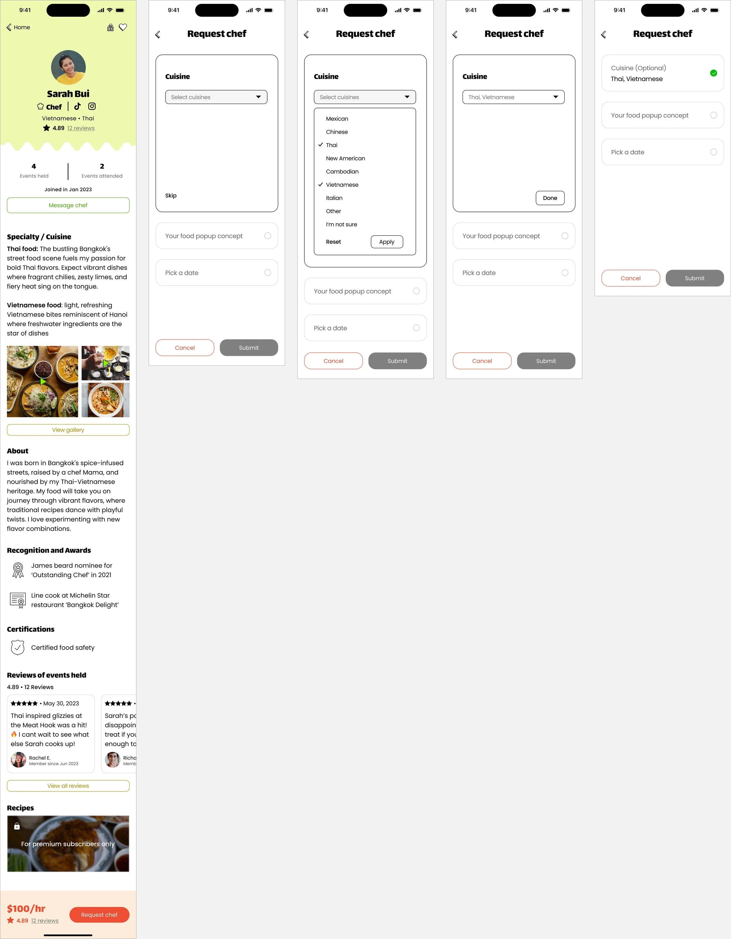
Requesting a chef while booking a space was confusing. Most participants believed there was too much friction introducing the action to request chefs while browsing spaces . Participants mentioned that this flow deterred attention away from the main task of booking a space.
When asked about logo design, participants envisioned food pop-ups as casual, community-driven events with an unpretentious vibe. Given “pop-up” in the app name, all participants visualized a logo with motion or a playful typeface.
MID FIDELITY ITERATIONS
During mid fidelity iterations, I explored different typefaces to find the ideal match for the app's vision. Following two rounds of iterations, I implemented 2 key changes:
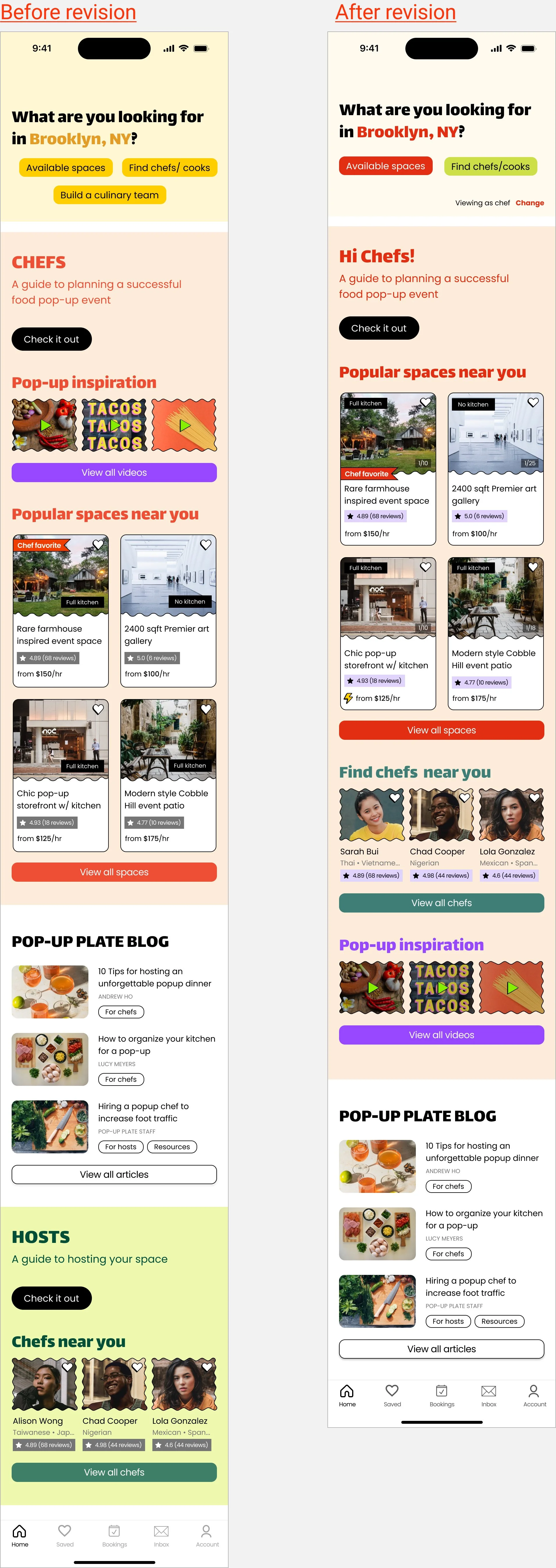
1. Landing page CTAs
To provide better context on the intended user actions, I modified existing CTAs and introduced additional CTAs
2. Separate browse a space and request chef flows
Before revision
You’ll see that the browse a chef’s profile action distracts the user from the original task to book a space.
After revision
Moving the chef information to the bottom of the screen keeps users focused on the main task to complete booking a space. Chef details can be accessed later in a separate step after booking a space.
Book a space
Book space CTA is sticky on scroll at the bottom of the screen for better accessibility and immediate user action. The ‘Want to collaborate’ section is moved to the bottom of the screen to imply that its a secondary feature.
Request a chef
The ‘Request chef’ CTA is sticky on scroll at the bottom of the screen for a consistent design pattern to booking
a space.I replaced the open-ended prompt “Tell us a little about why you’d like to collaborate…” with two focused questions: 'Pick a date' and 'Cuisine.’
BRANDING
Moodboard
The look and feel of the app should exude boldness, approachability, with a touch of cheeky fun. To embody these qualities, I imagine loud and vibrant colors, silly shapes and combinations that are playful and might break conventional norms. Unlike restaurants, pop-ups embrace imperfection, offering a casual and less refined atmosphere. Given their fleeting nature, pop-ups bring a sense of excitement, and provide chefs with a canvas for limitless innovation in the kitchen.
Logo exploration
For the initial logo exploration, I brainstormed words that came to mind when thinking of my app concept and also considered feedback from mid-fidelity usability testing — incorporating graphics and texts with motion.
I drew 2 versions intended to be a temporary logo, putting each logo on different screens for high-fidelity usability testing. To my surprise, the first logo was well received by participants. Participants said the hand drawn aspect felt organic and DIY and the imperfectly shaped plate fit the look and feel of the app concept. Given the positive feedback, I kept the logo for the
final design.
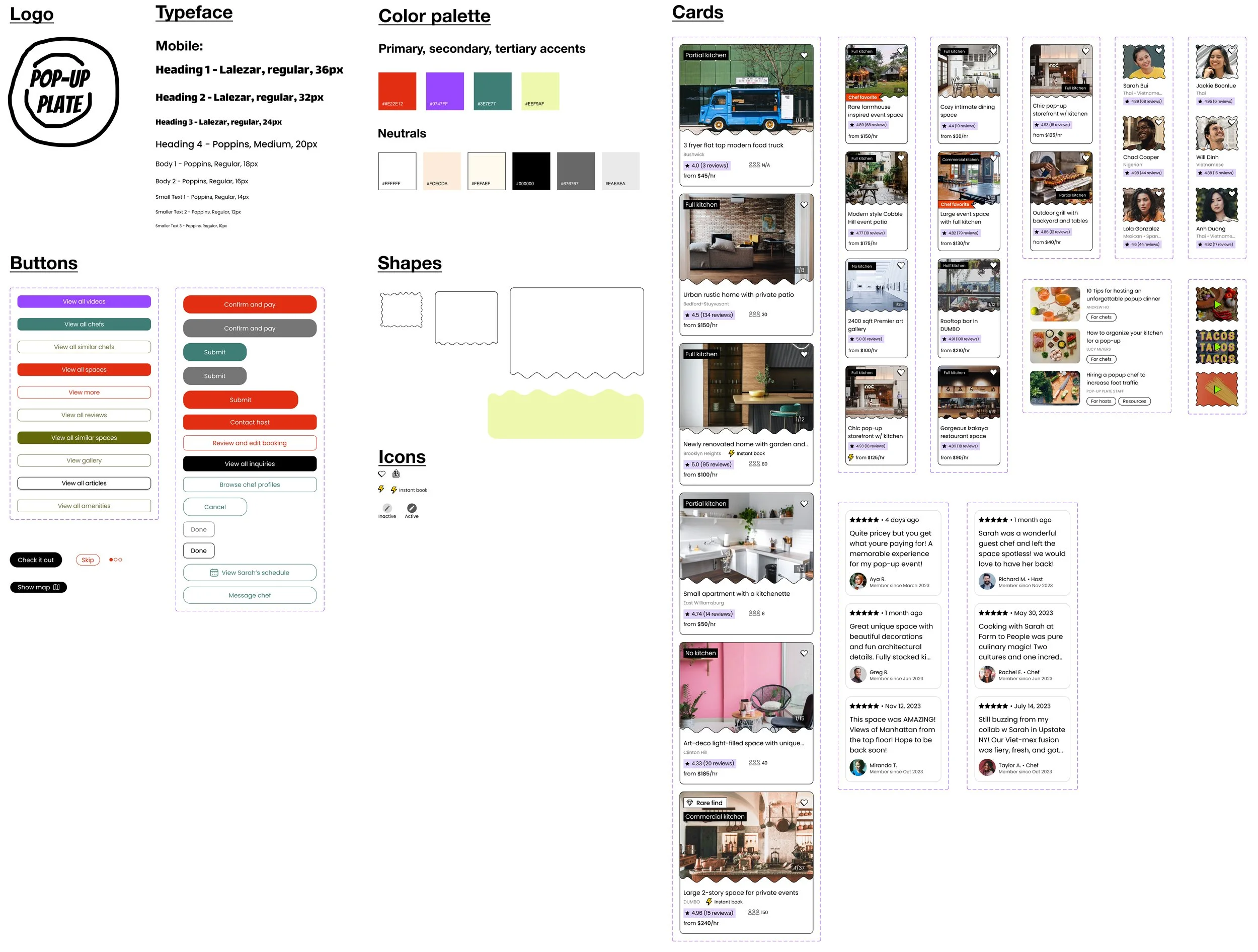
UI Component Library
HIGH FIDELITY WIREFRAMES
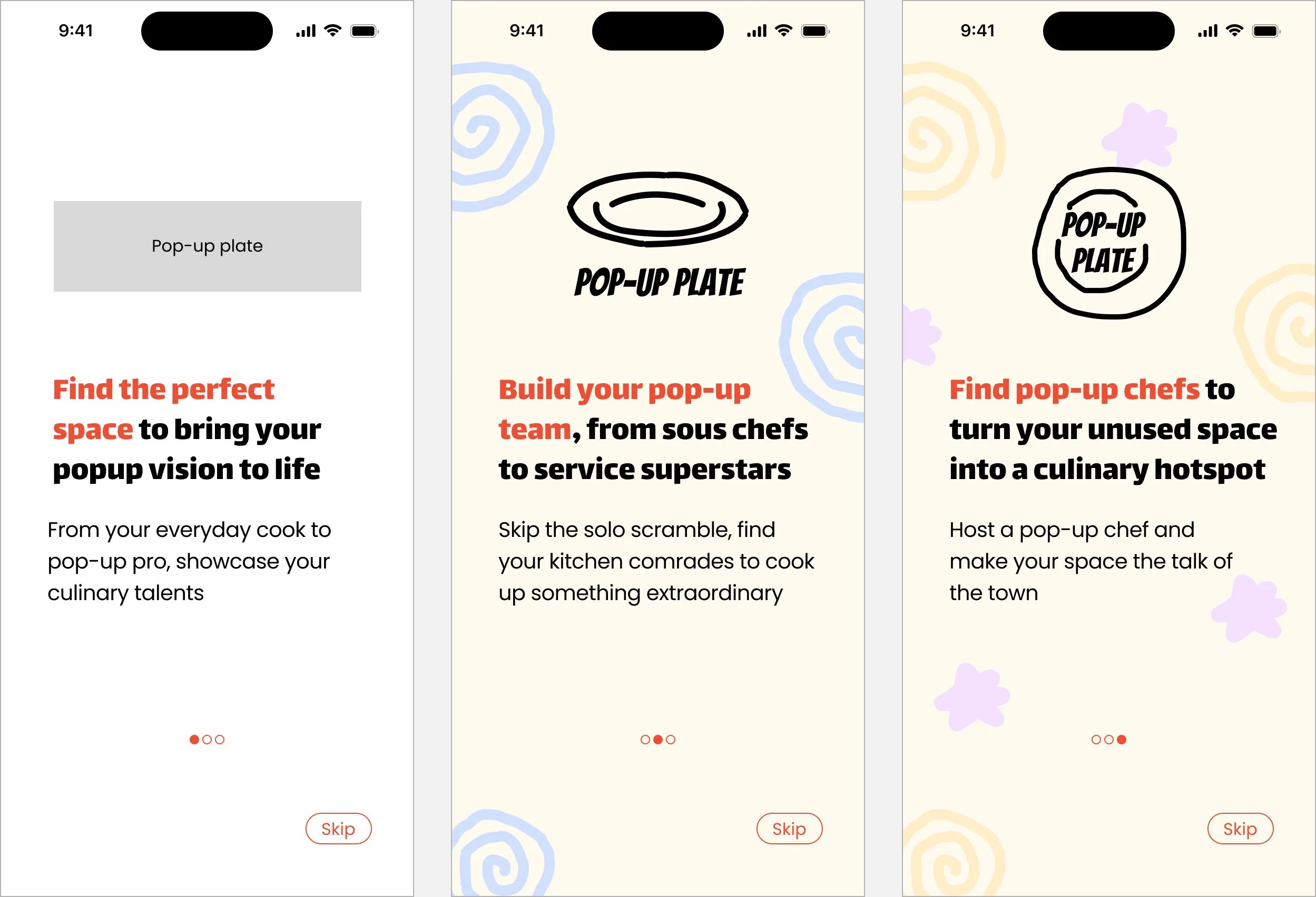
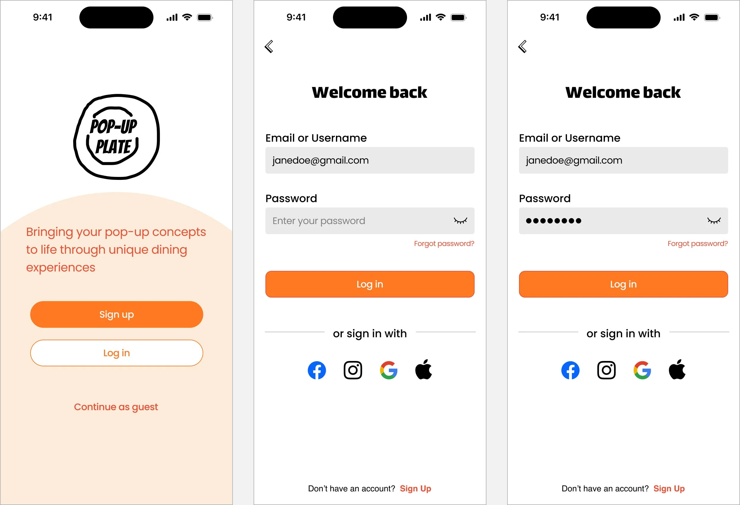
I originally did not have a logo for high-fidelity usability testing so the gray box served as a placeholder. After 3-4 rounds of testing, the gray box was replaced with some doodles that ultimately became my final logo.
6. TEST
My biggest challenge was recruiting chefs for high-fidelity usability testing, so I conducted testing with 12 pop-up attendees who simulated the chef’s perspective.
Similar to mid-fidelity test feedback, I created a feedback grid to synthesize and prioritize the insights across 4 categories — What went well, Questions from participants, Changes to make, and Ideas from participants. These findings highlighted both strengths and improvements of the screens.
Strengths
Design patterns: Design patterns felt intuitive and familiar, making the app easy to navigate
App concept: Most participants loved the app concept and strongly felt that it fulfills a real user need
Look/feel: Participants enjoyed the loud colors, squiggly lines, and typeface, saying it felt fun and high energy. This feedback matches my intention to target to Gen-z/early millennials
Logo: Although the logo was purely accidental, all participants loved it for its organic and imperfect feel, even suggesting the connection to the beauty of hand ceramics
Space page: The space screen was the strongest screen, with participants praising its thoroughness and inclusion of key information that chefs would want to know before booking
Improvements
Consistency of look/feel: The playful look and feel (i.e. squigglies and bright colors) can be incorporated to more screens to improve overall consistency and brand identity
Unify CTA colors: Participants recommended pairing down the number CTA colors to establish a clear hierarchy of primary, secondary, and tertiary colors
Landing page tooltip redesign: Address confusion on tooltip by tailoring tooltips to specific user groups (chefs vs hosts) and directly point tooltips to the corresponding buttons for clarity
Landing page feels busy: Most participant found the landing page busy as it attempted to address the needs of 2 distinct user groups with opposing goals, all within the same screen
Add an instant book indicator: Participants pointed out that unless there is an instant booking option, they expect most bookings to be pending until the host approves
Streamline Date/time selections: Date and time selection is very subjective. Some preferred to sort by time first before date or vice versa.
Request a chef - source of profile reviews: Indicate whether reviews are from chefs, hosts, or some other audience
Request a chef - remove cuisine option: Cuisine is repetitive to the ‘Your pop-up concept’ prompt
Request a chef - add additional prompts: Participants recommended swapping out the "Cuisine" option for more specific prompts -- listing collaborator’s responsibilities for the pop-up, expected pop-up hours, and a link to a space (either booked, pending, or a possible option)
7. ITERATE
After 10 rounds of iterations, I streamlined the design with 5 key improvements, resulting in more intuitive interactions and an improved content design.
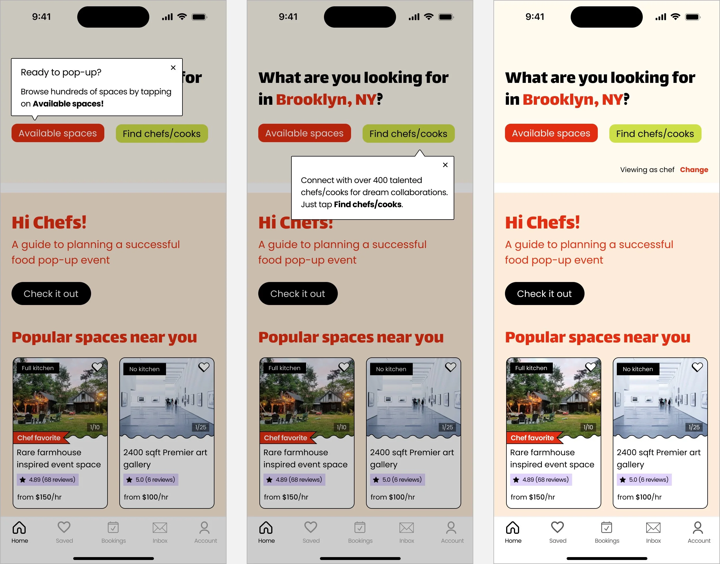
1. Landing page and tooltip redesign
Participants pointed out that the landing page felt busy because it served 2 audiences. I made three major updates to improve audience clarity.
Update #1: A personalized landing page experience
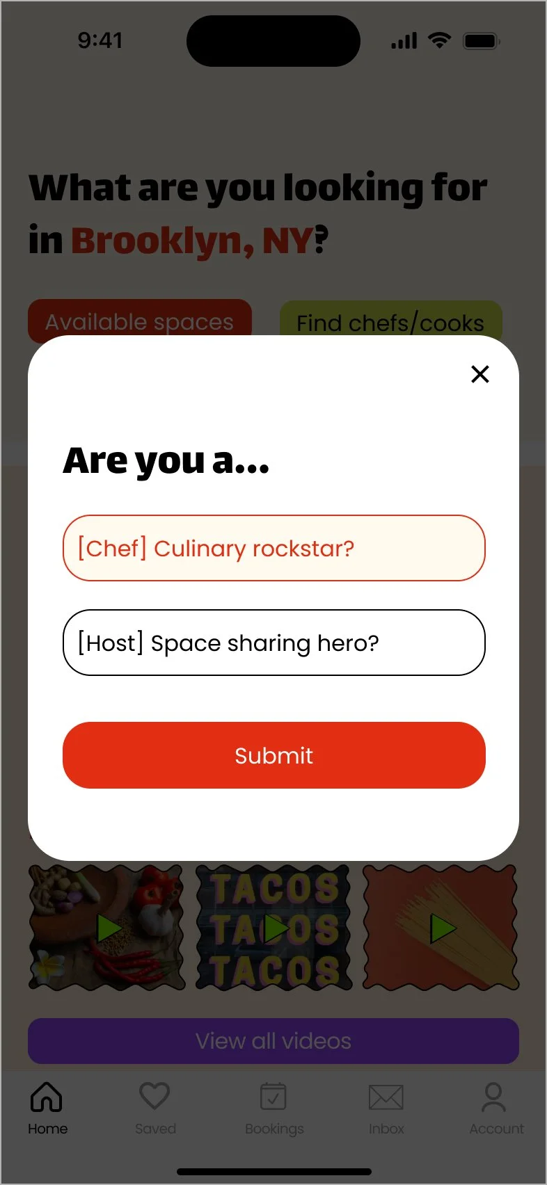
I introduced a modal for users to select the audience that best describes them — are you a chef or a host? The landing page is customized based on the selection chosen.
Update #2: Tooltip redesign
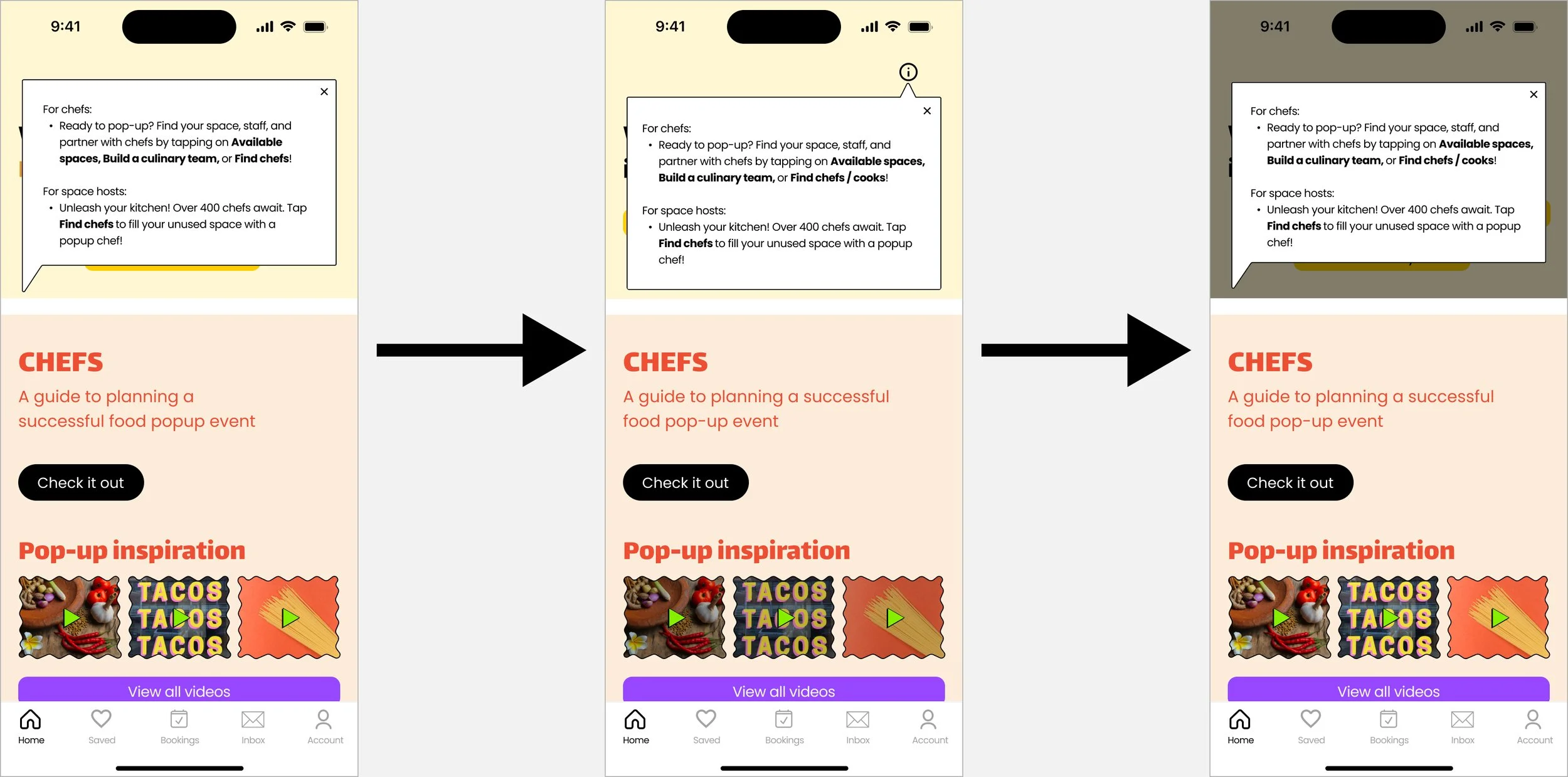
Throughout testing, I modified the tooltip which evolved with each iteration.
For the final revision, I split up the tooltip text into 2 distinct sections, each tooltip guiding users to the appropriate CTAs. The "Viewing as chef Change" serves as a toggle, enabling users to seamlessly switch between chef and host-specific content.
Update #3: Remove host specific content
For this project, my primary user group is chefs. I removed the sections designated for hosts to minimize distractions and simplify the interface. As a reminder, the landing page dynamically adjusts its content based on the audience selected on the modal (from Update #1), ensuring a personalized user experience.
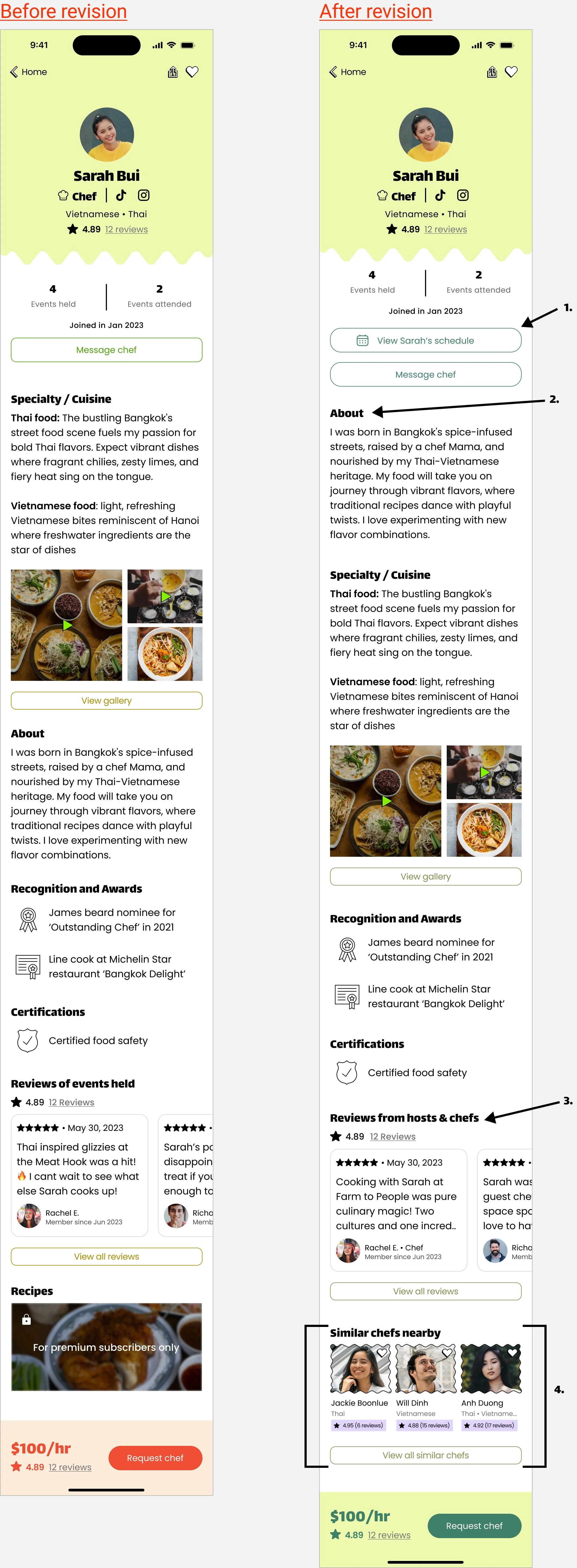
2. Chef profile - information architecture and content design changes
Added ‘View chef’s schedule’ CTA: This allows users to quickly access a collaborator’s schedule before initiating a request. From testing, participants had a strong preference for a streamlined date/time selection process.
About section placement: The about section was moved above “Specialty/cuisine.” Insights from testing suggested that prioritizing the "About" section provides a more intuitive user experience.
Reviews header: The previous header was vague and has been replaced with "Reviews from Hosts & Chefs," explicitly stating that the source of reviews are from both audience types.
Replaced ‘Recipes’ with ‘Similar chefs nearby’: The recipe section did not add value to the user and was replaced with “Similar chefs nearby.” This change facilitates the discovery of other chefs that share similar specialties, streamlining the search process for discovering chefs.
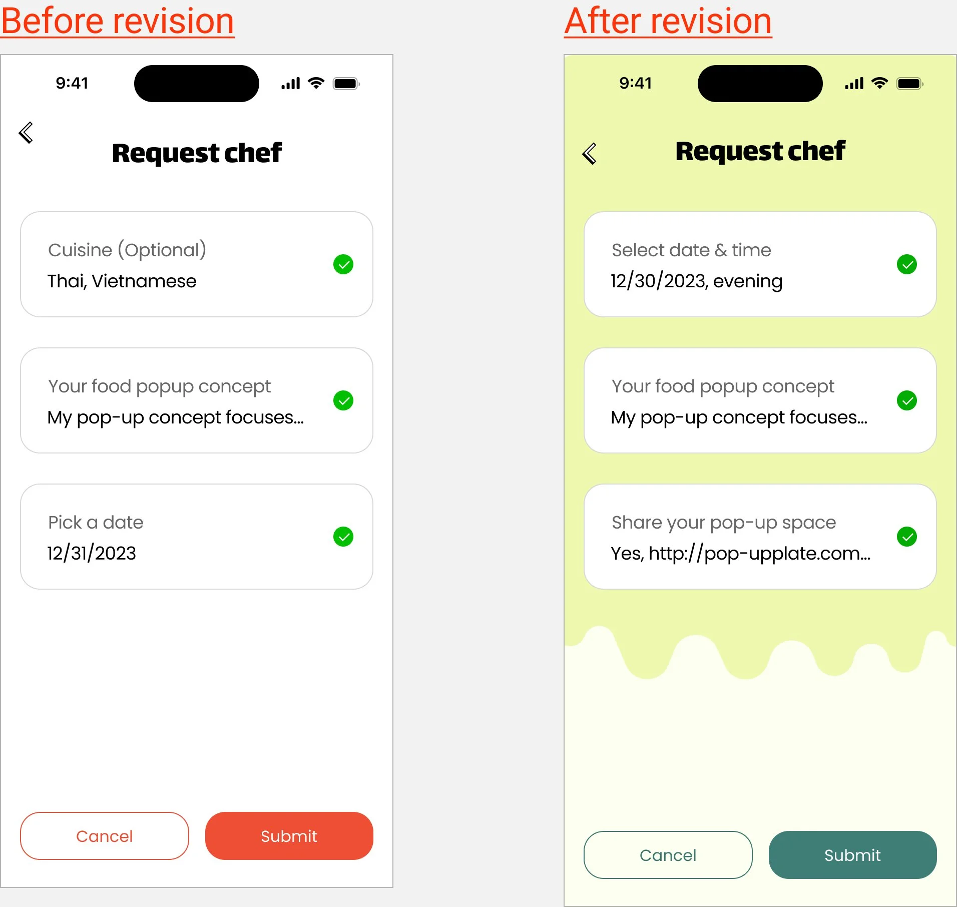
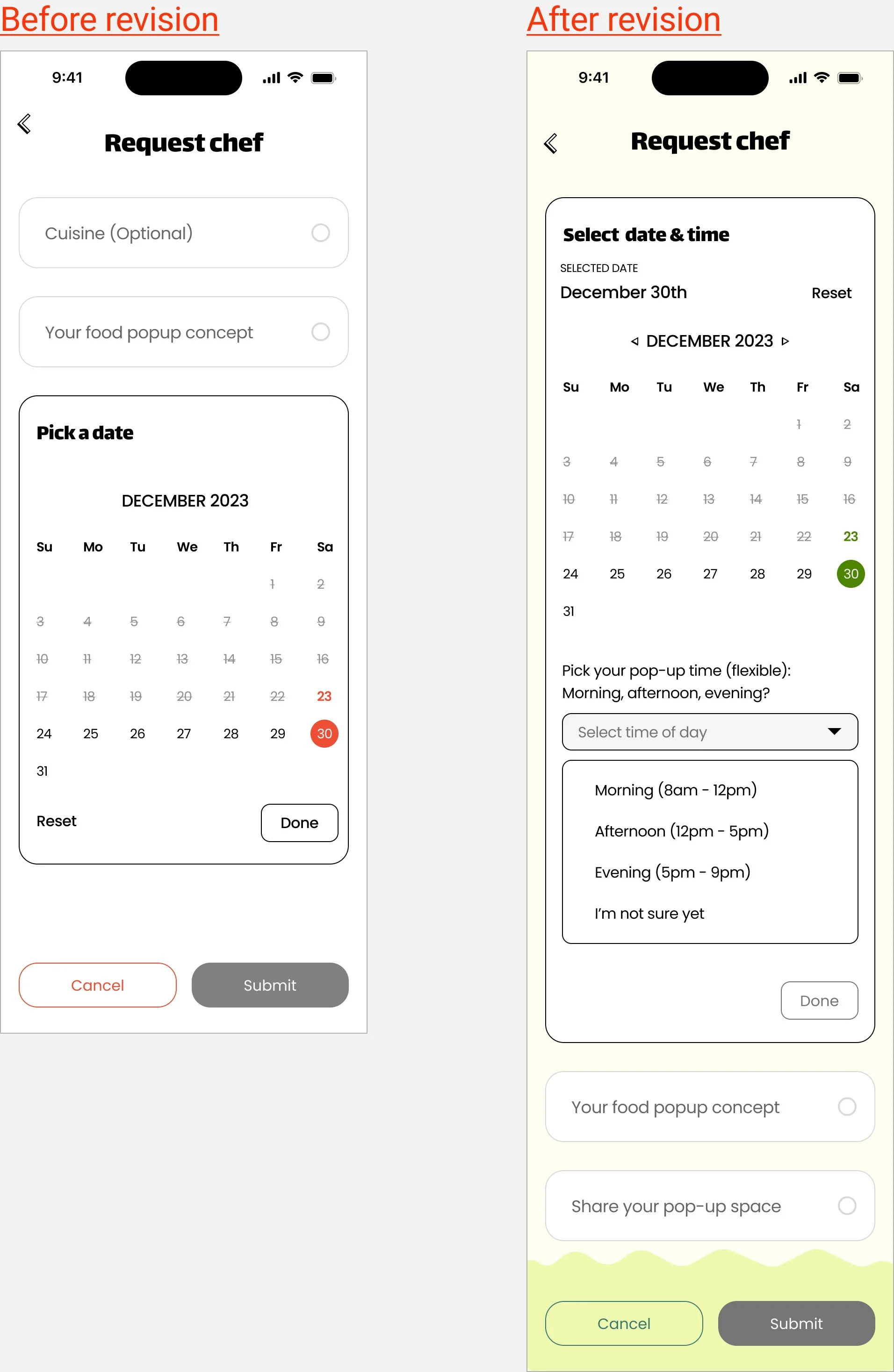
3. Improved request chef prompts
Participants suggested enhancing this flow with more detailed questions, specifically addressing what chefs want to know before collaborating:
Reorganized prompts: I rearranged the content to prioritize the most important information: Date/Time > Share Pop-up Concept > Share Space.
Polished wording for Date/time: Changed from ‘Pick a date’ to ‘Select date & time’
Replaced the "Cuisine" option with ‘Share your pop-up space ’: Selecting a Cuisine was redundant and was replaced with share your space. This prompt allows users to directly inform the collaborator (chef) whether a venue is secured for the event,
Improved date/time selection: Since participants valued an efficient date/time selection process, I added a follow up question to gather info on a general time of day for the planned pop-up.
4. Unify overall look and feel
Participants mentioned that the tone was not consistent throughout the screens. To make the look and feel balanced, I made the changes below:
Reduce color palette to 3 distinct colors: I originally had 4 colors (yellow, purple, green, red) on the landing page which have now been paired down to 3 distinct colors
Enhanced search filter for browsing spaces by adding color: I added pops of red to search filter selections for spaces. Previously these screens were black / white
Enhance look and feel of the request chef flow: Participants mentioned that this flow lost its playfulness. For a cohesive experience, I added green waves in the background to amplify the feeling of playfulness. I replaced the accents of red with green to visually differentiate the 2 features.
To see these changes across all screens, see the final prototype in the next section - ‘Final version.’
FINAL VERSION
Browse and book a space
Chef collaboration request
8. CONCLUSION
NEXT STEPS
Conducting usability testing with chefs is crucial to ensure the app effectively achieves product-market fit. Based on user feedback, future iterations will explore an A/B testing of the "show map" CTA to improve clarity, streamline the date/time selection process for a better user experience, and refine search filter options.
Looking ahead, long-term considerations include developing a monetization strategy to ensure the app's profitability. As the app expands to new markets, addressing state-specific food handling policies will be necessary. Finally, creating effective user acquisition strategies will be critical to attract both businesses and chefs and drive user adoption.
REFLECTION
Recruiting chefs proved to be the biggest hurdle. Limited access to chefs forced me to get creative, leveraging friends-of-friends and online forums to gather initial user insights. Unfortunately, within project constraints, I couldn't secure chefs for high-fidelity testing.
However, I had a strong vision of who my target age group would be, as someone who frequents food pop-ups. This allowed the app to evolve organically with each iteration. My initial exploration encompassed various app concepts, but participant insights ultimately steered the direction towards a space-renting solution. Notably, creating a moodboard proved most instrumental in solidifying the app's visual identity.
This app has the potential to expand beyond a focus on food and pop-ups. It could evolve into a one-stop platform for the culinary industry, streamlining ghost kitchen rentals, private chef bookings, vendor connections, and much more. The possibilities are exciting, and I'm eager to delve deeper into its development.
Stay tuned for more updates!

